Cheyenne Johnson
Staff Writer
Photo by Morey Spellman
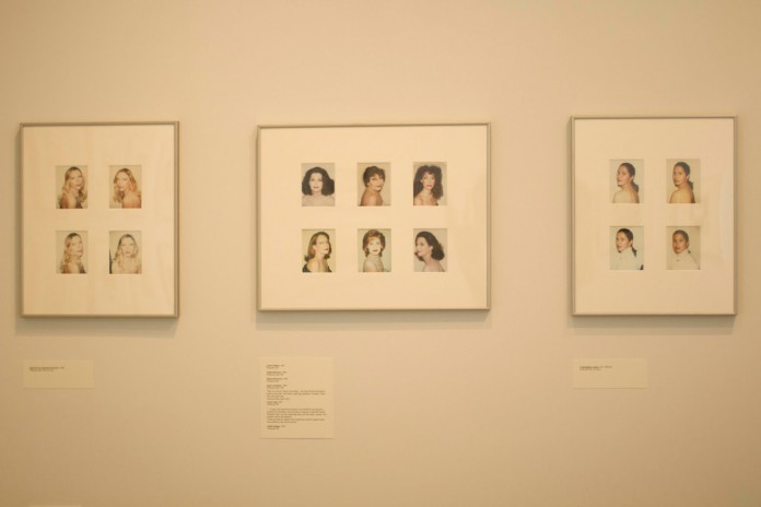
Inside the newly renovated (and finally accessible) Art, Design, & Architecture Museum hangs a humble collection of Andy Warhol photography titled “Fame and the Mundane,” which pays homage to Warhol and his pop art work. Warhol is most known for his style in which he cartoonized Hollywood and mass consumerism, and his dabbling in photography where he called his photos his “visual diary.” The exhibit, which runs until May 12, presents Warhol’s visual diary to the students of University of California, Santa Barbara.
Unfortunately for Warhol, the exhibit proves what many already know; publishing your diary for mass consumption is sometimes embarrassing, usually boring, and never a good idea.
The small collection at the museum, a seemingly random photo set of street corners, parties, and faces long lost to time and memory, is dull, to be frank. It’s lacking in life. It’s an 8 a.m. class on a Friday where the professor talks like a computer and doesn’t use a PowerPoint.
The photos that should look bright are faded; all the color, vibrancy, and thought Warhol offered in his “Marilyn Diptych” and “32 Campbell’s Soup Cans” is made absent by time and a seeming lack of inspiration. Warhol seems incapable of translating his thoughts and ideas that offended and inspired artistic movements into photographs that can capture anything beyond sporadic candidness and mug shots.
The photographs suffer from their age and the advancement of camera technology, which makes their faded and pastel appearance more reminiscent of an old family album than high quality art work. Even considering this, the photos don’t amount to much, and it’s doubtful that this collection, even with a modern camera and the availability of photo editing programs, could be anything awe inspiring or unique.
Images of bathroom toilets, skies blocked by high rises, and a dog—with their lack of editing or apparent specific focus—are nothing grander than stock photos, to be used only for doodle references and tacked up in office buildings. They lack an inspiration or a direction and have nothing to say nor encourage people to say anything about them. In an art world now controlled by meaning and inspiration, the “why” behind why a piece of art’s momentum, these photographs seem to only be personal shots taken to record a memory rather than add something to artistic expression.
Warhol’s portraits of the men and women of Hollywood are slightly reminiscent of his pop art ideology, though they severally lack in color and energy. The people presented are cartoon-esque in their presentation, occasionally holding a prop or covered in makeup, and for the most part, they at least capture the observer’s attention, if only for them to wonder if it’s someone famous.
This isn’t enough to redeem the collection, however. Even the torso-shots aren’t unique or intriguing so much as curious, and the collection as a whole presents no thrill of color or Warhol’s individual vision in the photographs. Everything seems lacking in his perspective and appears to be more of a collection of personal anecdotes to his life than things he expected to be hanging beside his paintings.
The collection is small, occupying a space about the size of a dorm room, and considering the pieces presented, it’s not hard to imagine why it was in such a small space tucked in the corner of the museum. Since Warhol’s photography is little known and hardly viewed, I give Breanne Lewis, the undergraduate student of art history who organized the collection, credit for attempting to expose the students at UCSB to different versions of well-known artists.
However, I advise those at the Art, Design, & Architecture Museum to remember that just because someone’s famous, it doesn’t mean everything they’ve produced is worthy of admiration. To end where we began, Warhol once said, “I like boring things.”
Then I’m sure he’d like this exhibit.
