Selena Ross
“Open Dyslexic,” a font designed for people with dyslexia, has recently been made into an app called “OpenWeb,” which allows users to load Internet browsers in the new font.
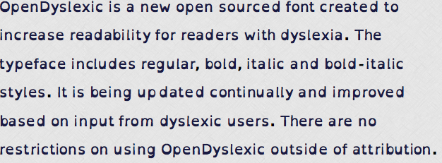
Developed by Abelardo Gonzalez, the font’s characters have “gravity,” or heavy-weighted bottoms that prevent the letters from wiggling or flipping upside-down, which is a common effect of dyslexia. Dyslexia affects one in 10 people, according to the International Dyslexia Association. The unique shape of each letter is designed to prevent them from flipping or swapping places, an effect that can understandably make reading difficult or nearly impossible.
Gonzalez, a New Hampshire-based mobile app designer, released the font open source—free and available for anyone to download. In a BBC News interview Gonzalez explained his decision to release the font for free, saying “I had seen similar fonts, but at the time they were completely unaffordable and so impractical as far as costs go. I figured there’s other people who liked the same thing but had the same issues, and so I though I’d make an open source one that everyone could contribute to and help out with.”
On the font’s website, a link welcomes users’ suggestions for improvements and criticisms. So far, the font seems to have had success.
“The response has been great; I’ve had people emailing me saying this is the first time they could read text without it looking wiggly or has helped with other symptoms of dyslexia,” said Gonzalez.
Despite the positive response, Gonzalez has been threatened with a cease-and-desist letter from font-maker Christian Boer. Boer accuses Gonzalez of copying a commercial dyslexic-targeted font Boer had developed a few years prior. On his website, apathyonline.net, Gonzalez laments Boer’s orders and instead praises another purchasable dyslexic font: “If you do wish to purchase a font, I instead recommend Gill-Dyslexic… He also never once threatened me for making similar.”
Gonzalez has continued to release his font for free in spite of Boer’s letter. In Gonzalez’s words, “No good deed goes unpunished.”
Although developed at the end of last year, the font has recently become more popular, partially due to its adoption by popular mobile app “Instapaper.” Instapaper allows users to download and save web browsers to read later offline and now offers the option to download read pages in the special font.
Another unique feature of the font is its use of italics. Generally, people with dyslexia avoid italics, owing to the difficulty of trying to read wriggling words that are already slanted to the side. Instead of the italic style, dyslexics typically use “slant x% for italics.” But OpenDyslexic’s italic style has been designed to allow for its use while still maintaining readability.
The Disabled Students Program (DSP) at University of California Santa Barbara works with students with a range of disabilities and handicaps, including dyslexia. With the praise that OpenDyslexia has received, perhaps DSP will begin to use the font.
So if letters seem to be moving of their own accord, consider adding some weight to their bottoms—it’s worked for many using OpenDyslexic.


Comments are closed.